UI & Interfaces
奢华个人色彩档案信息图
用于界面设计生成,主体为奢华个人色彩档案信息图。重点强调写实质感、结构化信息表达、拼贴分镜构图。
#UI & Interfaces#UI#Infographic#Realistic#Tech#Commerce#Education
Author@meng_dagg695Source URLhttps://x.com/meng_dagg695/status/2049822844918575586
Prompt Template
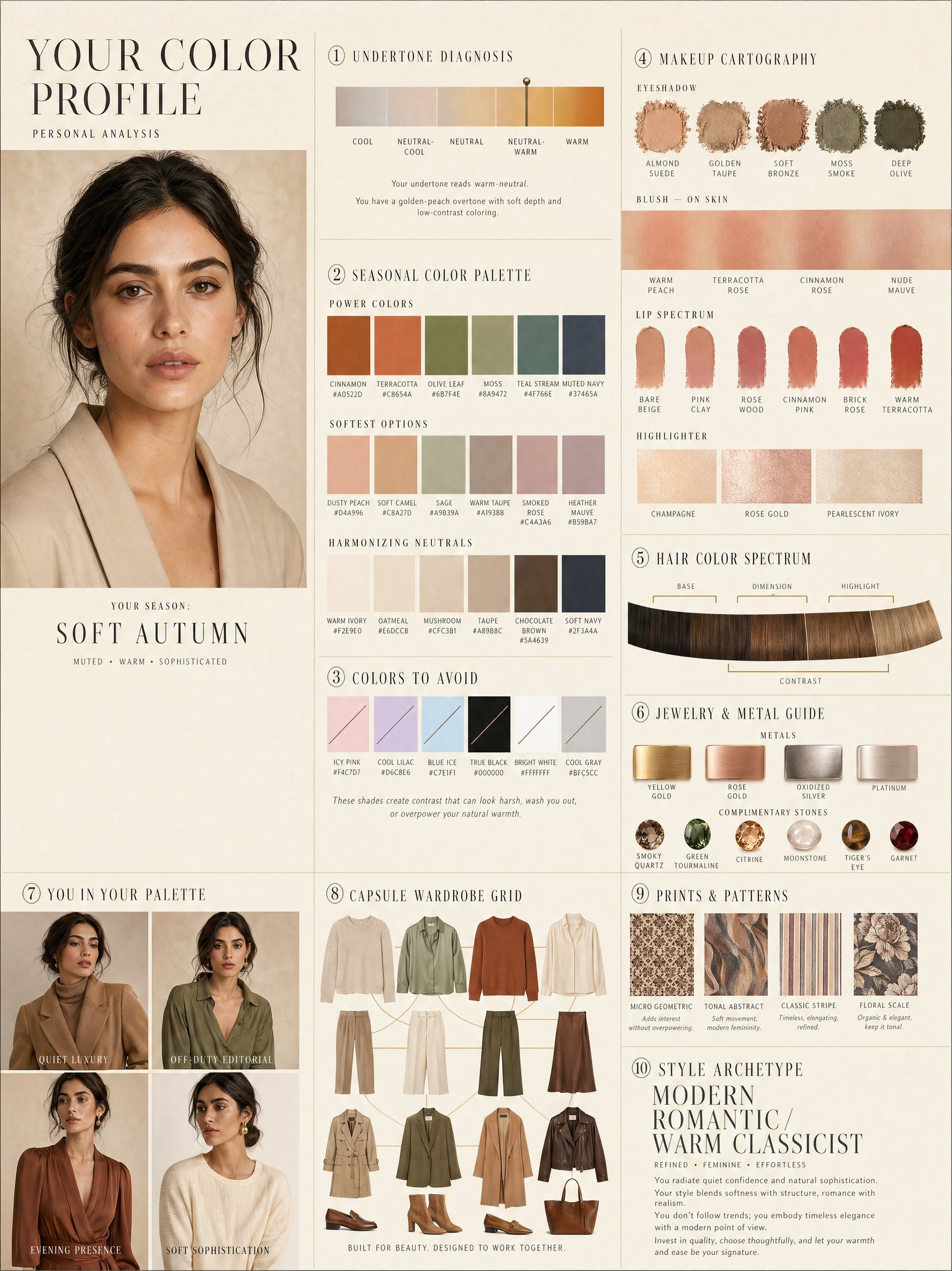
LUXURY PERSONAL COLOR PROFILE — EDITORIAL LAYOUT
Studio portrait of subject as anchor — skin retouched to luminous glass-like perfection, preserved natural structure, realistic pore texture, soft directional key lighting, no facial alteration. Background: warm ecru parchment with subtle linen grain texture. Layout reads like a Vogue Italia beauty supplement printed on heavyweight matte stock. Structured editorial grid, 3-column asymmetric, wide negative space, serif condensed display headers, all labels in spaced uppercase tracking, cohesive warm ivory/sand/ecru background system throughout all panels, ultra-photorealistic 8K, soft diffused studio lighting, flat elegant surfaces, no drop shadows.
PANELS:
① UNDERTONE DIAGNOSIS — Tonal spectrum bar from cool ash to warm amber, precision needle marker on subject's reading. Labels: Cool / Neutral-Cool / Neutral / Neutral-Warm / Warm. Fine annotation text.
② SEASONAL COLOR PALETTE — 10–12 fabric-textured swatches in subject's optimal season. Each labeled with poetic color name and HEX. Grouped: Power Colors / Softest Options / Harmonizing Neutrals.
③ COLORS TO AVOID — Desaturated row of clashing tones with fine editorial strikethrough. Clean, non-harsh presentation.
④ MAKEUP CARTOGRAPHY — Eyeshadow gradient dust swatches / blush tones fanned on skin strip / lip spectrum barely-there to bold / highlighter finishes labeled: champagne, rose gold, pearlescent ivory.
⑤ HAIR COLOR SPECTRUM — Curved gradient strip: base, dimension, highlight, contrast tones. Gold bracket indicators on best options.
⑥ JEWELRY & METAL GUIDE — Flat-lay editorial render: yellow gold, rose gold, oxidized silver, platinum finishes alongside complementary stone tones. Minimal styling.
⑦ YOU IN YOUR PALETTE — 3–4 editorial lookbook frames, subject in palette-correct outfits. Mood labels: Quiet Luxury / Off-Duty Editorial / Evening Presence.
⑧ CAPSULE WARDROBE GRID — Outfit flatlay: tops, bottoms, outerwear, shoes, bag — all palette-correct. Coordinating lines showing interchangeability. Net-a-Porter editorial aesthetic.
⑨ PRINTS & PATTERNS — 4 fabric print thumbnails: micro geometric, tonal abstract, classic stripe, floral scale. One-line styling note per print.
⑩ STYLE ARCHETYPE — Single typographic panel. Style identity title set large (e.g. "Modern Romantic / Warm Classicist"). Three defining aesthetic words. Four-line editorial wardrobe philosophy note.
RENDER SPECS: Ultra-photorealistic, 8K, editorial magazine print quality, warm neutral color grading, soft diffused studio lighting consistent across all panels, one serif display font + one fine sans-serif body font, no gradients, flat matte surfaces only.
Gallery